

To create these personalized playlists, RempBump takes into account various factors such as the user's age, region, and background. This ensures that each user gets a bespoke selection of songs that resonate with them on a deep and personal level.
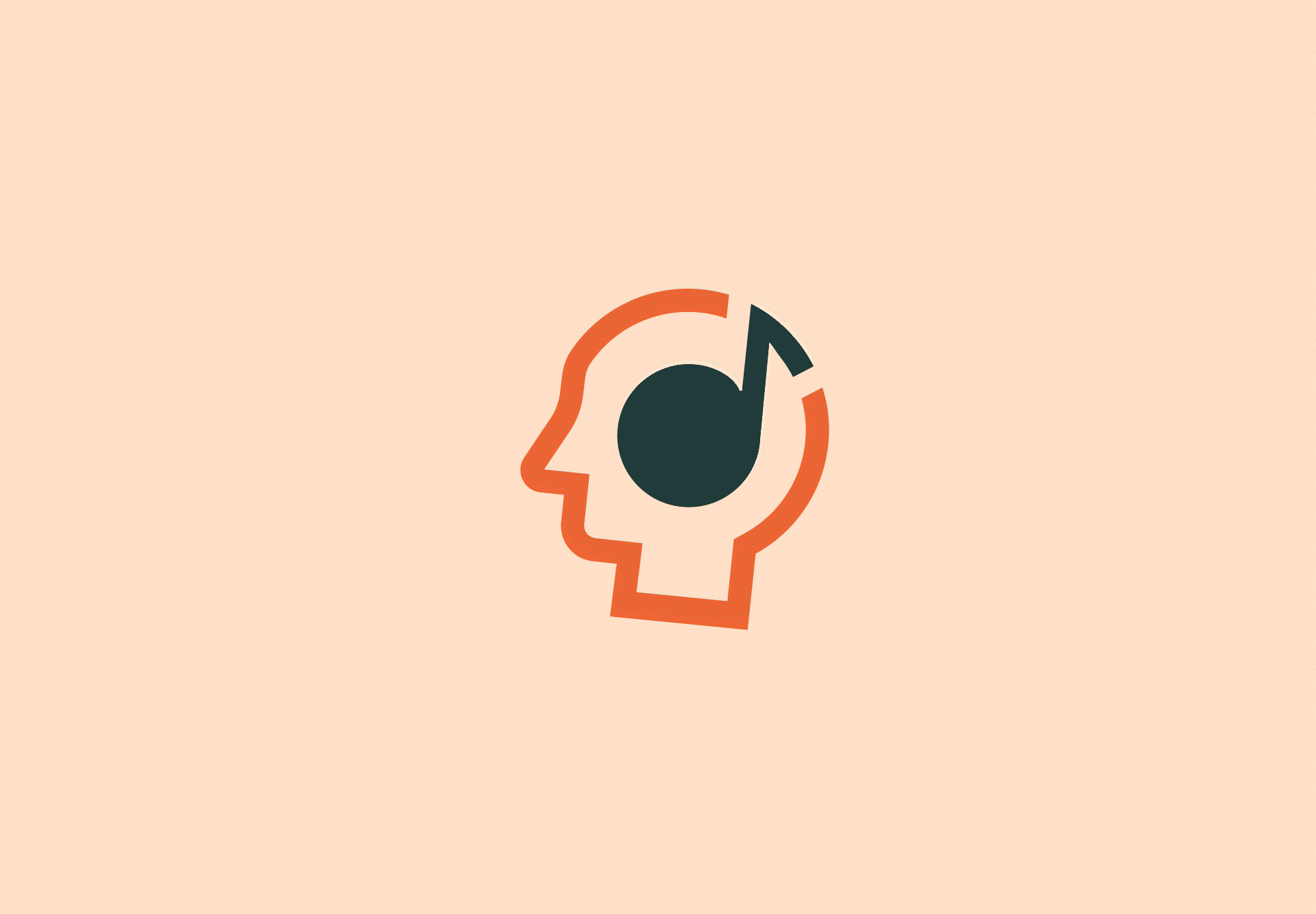
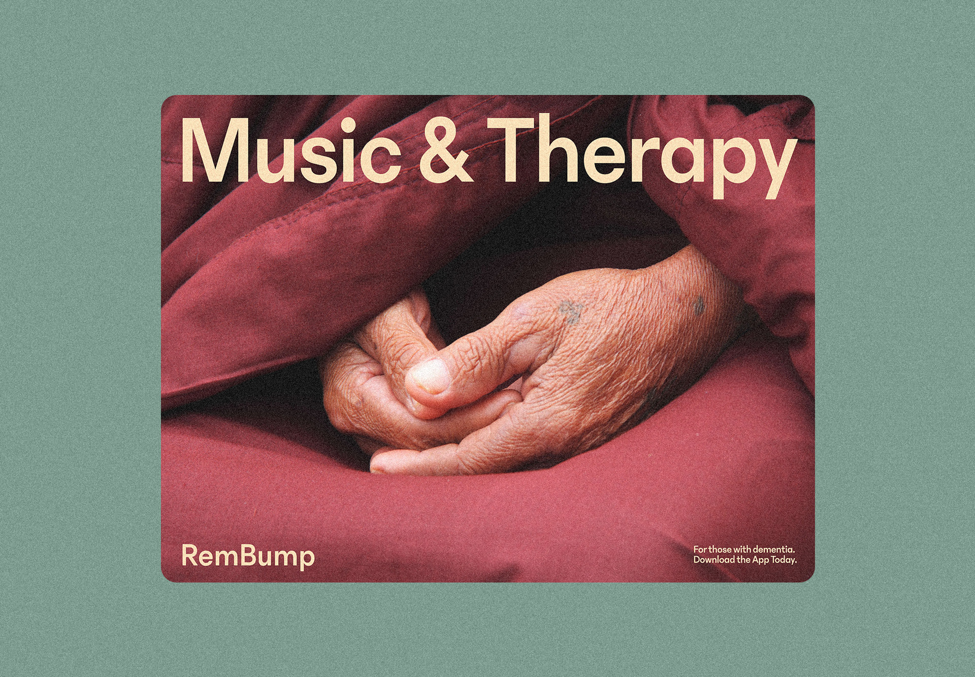
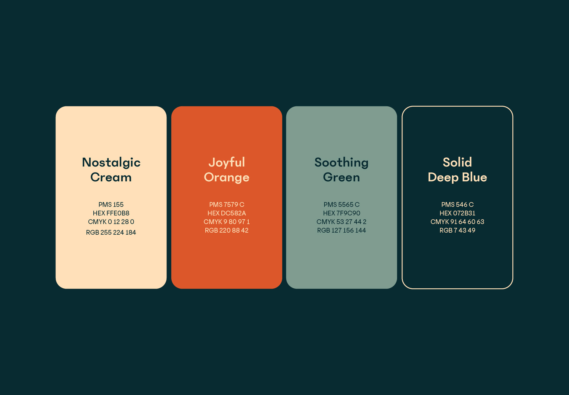
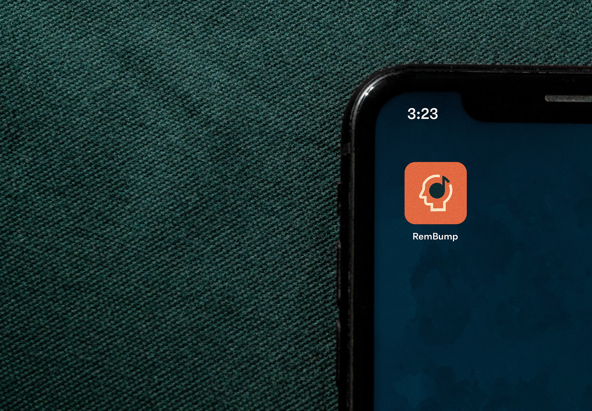
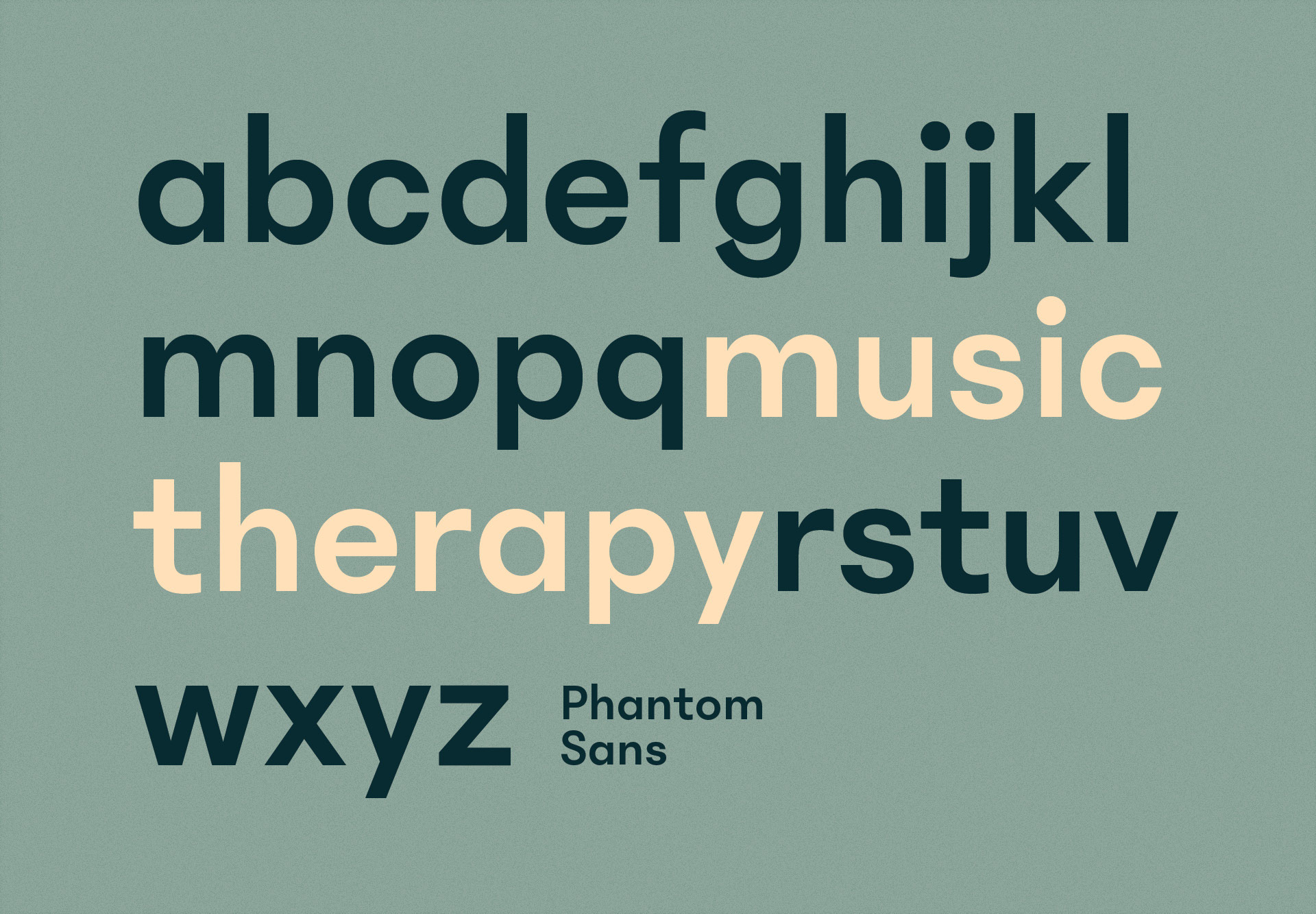
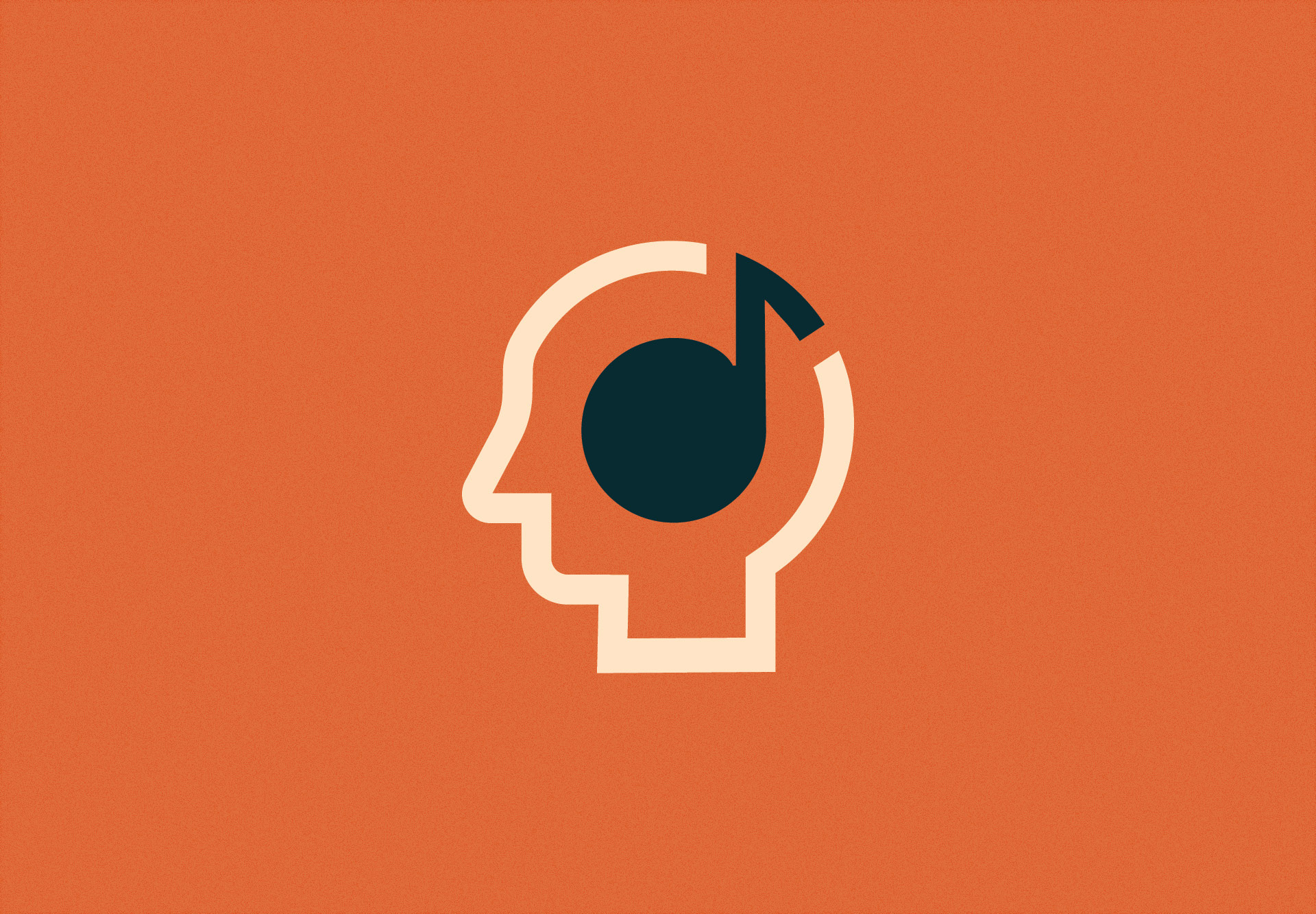
For the branding, we wanted to create an approachable and user-friendly system. The app features warm, calming colours and a clean, simple logo that visually merges music and therapy. Additionally, we chose a highly legible sans-serif font for easy reading and photography that is compassionate and approachable.


CREDITS:
Creative Direction: Zoë Boudreau
Client: Chris Reineck
Font: Phantom Sans
Photography: Pexels.com
AWARDS + RECOGNITION:
- Featured & highlighted on Ads of the World
- Featured on World Brand Design Society